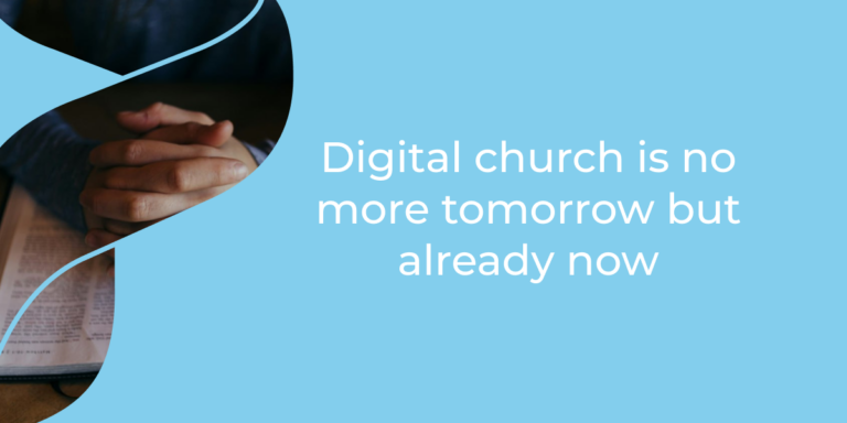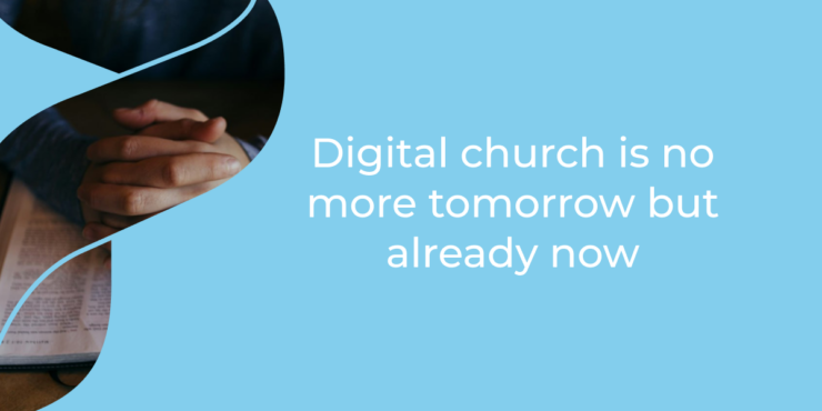
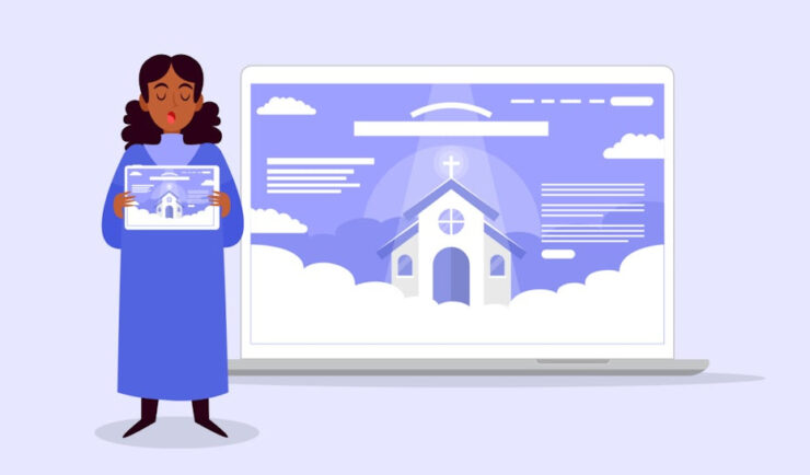
Old manuscripts were made slowly, with attention to order, beauty, and devotion. That is exactly why their style still works for church websites today. They remind visitors that faith communities are not only places for schedules and announcements. They are places of memory, prayer, art, music, and human connection.
For modern church website design, the goal is not to copy an old page exactly. The better approach is to translate the feeling.
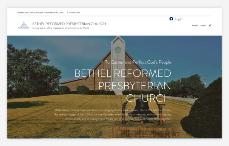
Think soft parchment tones, careful spacing, meaningful symbols, and headings that feel dignified without becoming hard to read. A good church website should feel calm from the first click, especially for someone checking worship times or planning a visit.
From Illuminated Pages To A Memorable Homepage
A homepage works a bit like the opening page of a manuscript. It sets the mood before the visitor goes deeper. In illuminated manuscripts, decorated initials and borders guided the eye toward important passages.
On a church website, that same idea can highlight worship times, visitor information, donation links, and community stories.
This is also where branding matters. A church can use a simple crest, wordmark, or text-based identity that feels traditional but still clear online. Tools like a text logo generator can help explore lettering styles before choosing a final visual direction.
Useful manuscript-inspired homepage details include:
- One strong title area instead of competing banners
- A warm background texture used lightly
- Decorative accents around key calls to action
Color, Texture, And Sacred Atmosphere
Old manuscript pages often feel rich without feeling loud. That is a useful lesson for churches online. Deep blues, muted reds, antique gold, ivory, stone gray, and olive green can create a spiritual mood, especially when paired with simple white space. The trick is to keep color meaningful.
Texture should be handled carefully. A slight parchment background can feel warm, while a heavy paper effect can make the site look dated. The same goes for gold details.
A little shine around headings or icons can suggest illumination, but too much can feel theatrical. For churches connected to travel, pilgrimage, or heritage tourism, this atmosphere can help visitors feel the story of the place before they arrive.
What Manuscript Layout Teaches About Navigation
Manuscript pages were not random. Margins, columns, headings, and visual breaks helped readers move through dense material.
Church websites need that same sense of order because visitors usually arrive with a practical question. They want to know when services happen, where to park, how to contact the office, or what makes the church worth visiting.
| Manuscript idea | Website version | Why it helps visitors |
| Decorated opening page | Strong homepage hero | Creates a clear first impression |
| Margins and spacing | Clean page sections | Makes information easier to scan |
| Chapter markers | Simple menu labels | Helps people find pages faster |
| Marginal notes | Small info boxes | Adds context without clutter |
A thoughtful layout feels respectful. It gives every detail enough room to breathe.
Typography That Feels Historic But Stays Readable
Typography is where many church websites either shine or stumble. Old manuscripts inspire beautiful lettering, but digital visitors still need quick, easy reading. A calligraphic or Gothic-style font may work for a logo, a short heading, or an event poster. It should not be used for long paragraphs, sermon pages, or mobile menus.
A practical rule: use decorative type for atmosphere, and readable type for information.
That balance protects both beauty and usability. Pair one expressive heading font with a clean serif or sans-serif body font. Keep contrast strong, line spacing generous, and mobile text large enough for older visitors. A church site can feel ancient in spirit while still being very modern in function.
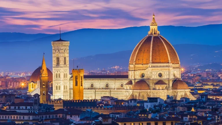
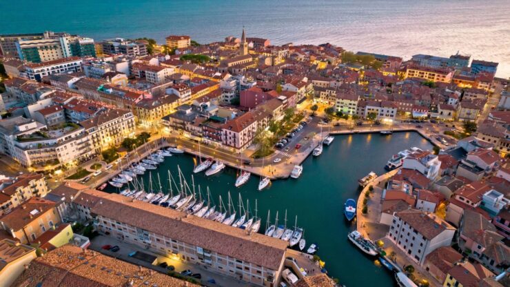
Storytelling For Visitors, Pilgrims, And Curious Travelers
Church websites often serve more than weekly members. They also welcome people planning a trip, tracing family history, visiting sacred art, or exploring a city’s religious heritage
Manuscript style can support that travel experience beautifully because manuscripts already feel like preserved journeys through time.
A strong visitor page might include:
- A short history of the church building
- Photos of icons, stained glass, manuscripts, or carved details
- Opening hours, accessibility notes, and nearby landmarks
- A gentle explanation of worship etiquette for first-time guests
This turns the website into a small guide before the visit, while supporting searches for historic churches, religious travel, pilgrimage sites, and sacred architecture.
Using Old Details Without Making The Site Hard To Use

Decorated initials, small borders, arches, vines, crosses, stars, and manuscript-style frames can all look beautiful online.
They work especially well on history pages, feast day pages, music pages, donation appeals, and devotional reflections. Still, restraint matters. Every design element should support the message, not compete with it.
Did you know: manuscript illumination gets its name from the glowing effect created by gold, silver, and bright color. In web design, that “glow” can be suggested through contrast, spacing, and small highlights rather than literal shine.
Keep these essentials easy to find:
- Service times
- Location and parking
- Contact information
- Events calendar
- Online giving
Beauty matters, but nobody wants to hunt for Sunday service behind five decorative pages.
FAQs
1. Can a manuscript-inspired church website still feel modern?
Yes. The key is to borrow mood, not clutter. Use clean layouts, readable fonts, and small historic accents. That combination feels current while still honoring tradition.
2. Should every church use medieval-style design?
No. It works best for churches with historic buildings, traditional liturgy, sacred art, pilgrimage interest, or strong heritage storytelling. A newer church may prefer a lighter version.
3. What pages benefit most from manuscript-inspired styling?
History pages, feast day pages, visitor guides, donation pages, music pages, and devotional reflections usually benefit most. Highly practical pages should stay simpler.
Final Perspective
A church website inspired by old manuscripts can feel warm, sacred, and memorable without becoming difficult to use.
The best designs borrow the patience of old bookmaking and combine it with clear modern structure.
For churches connected to faith, history, travel, and community life, that mix can make the site feel less like a noticeboard and more like an invitation.